Five Lessons in User Experience All Brands Can Learn From.
CBS News reported that the White House recently hired Jeffrey Zients to
head up a team to “fix” Healthcare.gov. They also stated they were reaching out
to experts and companies in Silicon Valley, trying to tap their expertise for
the rescue of the site.
Ok. Everyone knows that Healthcare.gov site has problems. The largest
ones being functionality that that doesn’t work and accurate data collection
and storage. This piece focuses on one other aspect, User Experience. Simple
tweaks that can make the experience a bit easier for the user to navigate the
site.
When a website launches, issues are inevitable but there are many
lessons that brands can learn from the government’s (aka your tax dollars’)
misfortune.
Let’s put all politics aside for a moment and take a look at some simple
UX tactics that could have been applied to minimize risk. I’ve read a lot about
the issues but the best knowledge is always first hand and I had to do a test
drive myself.
What did I find, you ask?
Oh, many issues but most can all be consolidated into the following five
points:
1.
You Need A Captain
2.
Estimate Initial Usage But Be Prepared for 10x the Volume
of Users
3.
Streamline Content – Don’t Distract The User With
Irrelevant Content
4.
Don’t Scare Them with Commitment Language Off the Bat
5.
Test Early and Rapidly
1. You Need A Captain
October 2011. That’s when the government began subcontracting out
development work for the website. Guess how many organizations this project was
subcontracted to? 47. Yes 47.
So with 47 different subcontractors, how could the government know at
any given point who was working on the site and who was responsible for the
most critical piece that would deem this successful – ie a successful user
experience?
It’s a given, when you are building a large site, that you will have
multiple departments, people and potentially companies working on it. That’s why it’s essential to have a UX
captain that is all along ensuring the testing and usability of the site. If you
don’t, you will fail. No blurred lines there. Your UX captain can serve as the
connective tissue from concept through development and launch. Use them, that’s
what they are there for.
2. Estimate Initial Usage But Be Prepared for 10x the Volume
of Users
The U.S. Chief Technology Officer Todd Park stated the government had
expected to draw 50,000-60,000 simultaneous users at any given time and they
were prepared for that. What happened?
On average over 250,000 users have been trying to log in since it launched on
October 1st. 250,000!!!! Remember if you are building a site where
you have stated your goal is “7 million users”, then scalability and capacity
is critical. If they can’t get in, you potentially just lost a number of users.
3. Streamline Content for the User – Don’t Distract Them
With Irrelevant Content
I have to say one of my biggest pet peeves is when I’m in an experience
and I get presented information that is completely irrelevant to me at that
point in the process. Don’t do it, just don’t do it. Keep the experience clean
and guide the user down a path, don’t distract them.
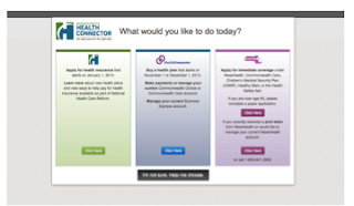
Here’s a prime example on the site. I get to the homepage, I decide I
want more information on Individuals and Families. Here are the series of pages
I am now taken through until I can finally take an action that I wanted to take
initially.
Hmm… ok I guess I’ll click on the big green button to get started.
Ok – I guess I’ll pick the one starting in January.
Hmm.. Wait what? Why am I seeing Small Business and Brokers here…
I thought I already told you I was an Individual. There doesn’t seem to be a big call to action – I guess I’ll click the individual tab
again?
TO BEGIN FILLING OUT.
So five clicks before I can even begin to fill out a form. Five clicks and that’s because I was able to figure it out and not lose hope along the way. The average user will not get past those first two clicks. “Healthcare.gov”, why are you making me click so many times? Why can’t you just take me to this page immediately?
4. Don’t Scare Them with Commitment Language Off the Bat
These words are on the homepage and the largest calls to action. My guess is users want a little more information before committing to an application. Something as simple as Learn More and Apply may ease the experience for the user coming here for the first time and keep them moving through the process.
5.
Test Early and Rapidly
I can’t
mention this enough. Even if you only have sketches, testing makes a
difference. The smallest tweaks and enhancements can make or break your site.
You don’t have to test a gazillion people either. You will begin to see trends
after 5-7 users. Do it. Do it often. You won’t be sorry.
“Sources tell CBS
News the underlying software was riddled with junk computer code, which means,
one expert said, "No way it was properly tested before it went live.”
I rest my case.
In summary, launching a site at this scale is no simple feat. There are
bound to be hiccups along the way. However simple UX guardrails can be applied
to minimize risk at launch. Now go find your UX team ASAP! Or call me if you don't have one! :)
Check out my coverage in Ad Age.
----
Visit my site www.utopia46.com for more UX info!
Check out my coverage in Ad Age.
----
Visit my site www.utopia46.com for more UX info!


